Like many of you this Thanksgiving break, watching Wicked was at the top of my list. I came away from the film unable to shake the set design and color palettes.

[From Architectural Digest: The library’s circular elements are activated during musical numbers. Photo: Giles Keyte/Universal Pictures]
In Wicked, the visual aesthetic is as powerful as the performances themselves, with the film's color palette playing a crucial role in weaving together its themes of magic, duality, and grandeur. The muted, and at times saturated, pastel tones create a dreamlike atmosphere, while the saturation is just enough to feel grounded in the real world—albeit a fantastical one. Among the standout features of the film’s art direction are the nude-pink hues accented by vivid touches of bright blue, as well as the subtle pairing of pinks and greens, which speak to a refined, almost vintage sensibility, yet feel undeniably modern.
The Power of Pastels: Nude-Pink and Blue Accents
The nude-pink tones in Wicked are evocative of softness, femininity, and timelessness, but it's the subtle accents of faded, bright blue that elevate this color pairing into something unexpectedly dynamic. The combination suggests both innocence and rebellion, an undercurrent of complexity that mirrors the intricate lives of its characters. The bluish tinge breathes life into the otherwise subdued palette, evoking a sense of contrast and tension, a visual manifestation of the film’s central theme of duality—particularly the complicated bond between Glinda and Elphaba.
In this color scheme, there is a sense of both nostalgia and contemporary coolness, as if the film is drawing from a distant past, but with a clear and deliberate modern twist. The pastel pinks aren’t overly saccharine; they’ve been muted and aged, inviting you to explore their more somber side. The blue accents, on the other hand, serve as a lively contrast to the pink’s muted warmth, offering bursts of vibrancy that mirror the film’s more surreal, magical moments. This balance of softness and electric intensity works its way into both the architecture and costumes, leaving an indelible mark on the viewer.
Faded Maximalism: Folkloric Patterns and Art Deco Influences
One of the most compelling aspects of the film's aesthetic is its flirtation with "faded maximalism." There’s a deliberate sense of opulence, but one that feels just a bit weathered or nostalgic—like discovering a grand heirloom that has been passed down through generations. This aesthetic nods to folkloric patterns, yet expresses them in a very modern way. The result is a design vocabulary that is rich, layered, and at once playful and serious.

[From Architectural Digest: The Emerald City nods to historical precedents like Carlo Scarpa and Daniel Burnham’s campus at the 1893 World’s Columbian Exposition. Photo: Giles Keyte/Universal Pictures]
Art Deco influences come to the forefront in the design of the Emerald City, where deep emerald greens, glistening golds, and lavish geometric patterns dominate the scene. This style is both glamorous and a little fantastical, a perfect blend of luxury and illusion. The sharp, streamlined forms of Art Deco contrast with the more organic, whimsical forms found in the city’s detailing, echoing Wicked's exploration of two opposing yet interconnected worlds—the glamorous, privileged world of Glinda versus the misunderstood, rebellious world of Elphaba.

[From Architectural Digest: An interior of the Wizard’s palace. Photo: Giles Keyte/Universal Pictures]
These Art Deco elements are not just confined to the Emerald City set, but appear in subtle ways throughout the film, even in the smaller set details: from the geometric, stylized architecture to the intricate, hand-painted patterns that evoke vintage chinoiserie or Portuguese tiles. These references help tie the visual design to historical and cultural movements, yet the application of them feels fresh and timeless.
Bringing Wicked Into Your Own World
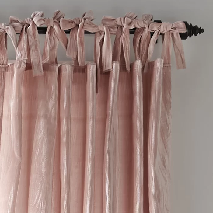
There’s no reason why these beautiful color palettes can’t make their way into your own home or wardrobe. The nude-pink tones, for instance, are incredibly versatile. Use them to create a warm, inviting atmosphere in your living space—pair them with soft whites, muted golds, or warm wood accents for an effortlessly chic look. For a more daring approach, you can add those sharp, faded blue accents to introduce vibrancy and energy to the palette. This color combo works just as well on a cozy throw pillow as it does on a painted accent wall.
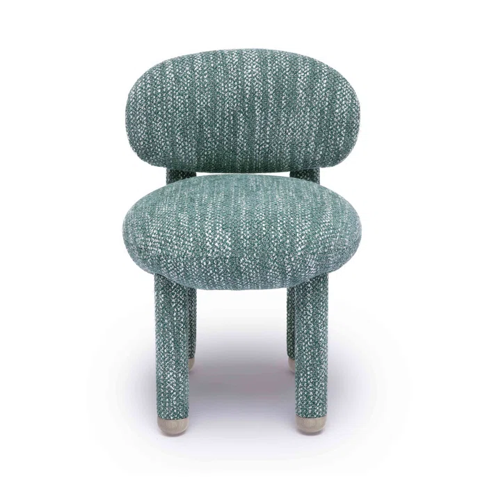
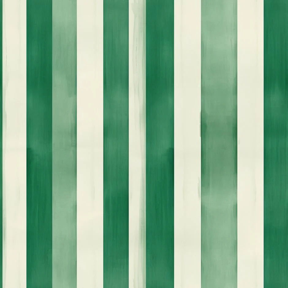
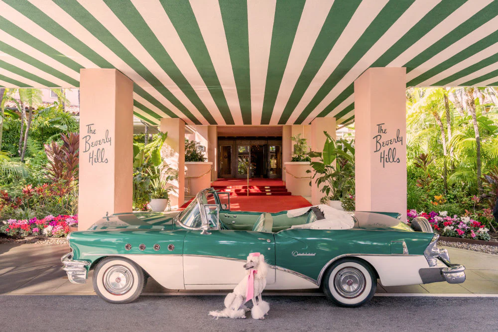
As for the pink and green combination, this is another stunning palette that can be embraced in both fashion and interior design. The faded green tones evoke a sense of tranquility and nature, while the soft, warm pinks bring in just enough femininity without feeling overly delicate. This pairing works beautifully in floral arrangements, or in soft linen fabrics and textured cushions.
Mood Boards
Click through my mood board visuals below for some eye candy inspiration, sourced based on my interpretation of the set design and color palettes. All photos are courtesy of Pinterest.
Faded Folkloric Modern
A Rich Story in a Saturated Fade
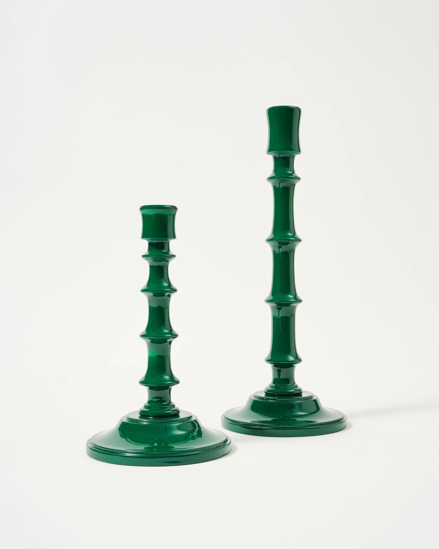
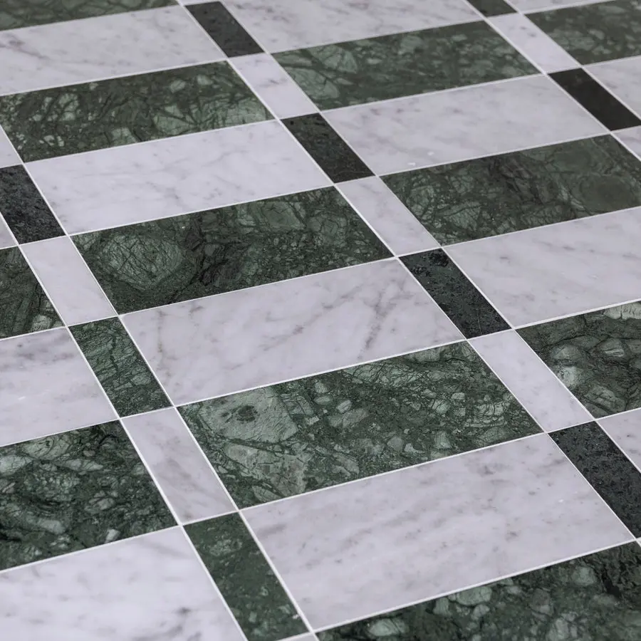
Deco Verde
Art Deco Serenity: The Green & Nudey Pink Balance










Comments